Relax with the labels, craft beers

Don't judge a book by its cover. It's what's on the inside that counts. Unless it's beer.
Beer cans are a purpose-driven object. It's meant to bring the beer into your house, then your mouth, safely. And they've looked really similar for a long time. It's natural for craft breweries to want to differentiate from the norm, to walk away from the slick simplicity of a Coors Light can, or the regality of a Bud Heavy. The issue is in the way craft breweries are doing this: cranking design up to 11, using tacky fonts and bad puns. This is probably because most of these places aren't huge entities; they don't have the money to hire on a designer so they use a buddy that knows photoshop and throw "Dank" into the title of whatever IPA they're currently brewing. This leads to some crazy designs that are tacky, busy, and most importantly inconsistent. There are breweries that I go to that I love emphatically, but I wouldn't recommend anyone visit their taproom that looks like they set up shop in an abandoned Tilly's. You can be cranking out some serious juice, but you'll never make it into a Whole Foods until you can look presentable as an end-cap display next to artisanal cheeses.

Rather than bash breweries that I think could use a facelift, let's talk about some places that are doing it right. Modern Times is a California behemoth. Every time I see something new come out, I know what I am going to see the can design look like. MT does two different series, the first being their recurring beers come in a sexy white can, script logo centered, three stripes of color at the bottom of the can, and three words that describe the beer under the title. The colors deviate, but the pattern stays the same. This means that when you're walking through a grocery store you see a section of almost all-white cans and can say "hey they have MT here" from the other side of the store. The other series is there one-time releases. These cans are busier, more colorful, but still hold a similar art style, big vibrant geometric shapes and their other logo, plus most of the time a similar font. They're gorgeous, and feel special compared to their usual stuff, but still scream the Modern Times brand.

Rigid styling isn't always necessary, though, to have a consistent brand. Mikkeller Brewing uses the same artist, Keith Shore, for all of their can designs. Keith loves simplified human figures that have flat coloring but still exude so much personality. Harry, the main character of most of the cans, has become a sort of logo without being shown in the exact same way every time. Mikkeller uses crazy colors, funny names, in a way that isn't busy and brash. They keep it simple, and they stay in my fridge. Hopefully, one day on my walls, too.

Unsung Brewing is another way to do a rather busy branding that still works. Their niche is comic book inspired from their taproom to their cans. Comic books are known to be vivid, loud, busy, all things I've listed as things to stay away from. Unsung's method for combatting this is to limit their color pallette; most cans feature 2-3 colors, and always pretty muted. Their Anthia, (by the way, all their beers are named after superheroes they create) is admittedly really busy. But the blue one blue of the background doesn't offend, allows the green from the subject to really pop, and you can appreciate the art style in a not-so-in-your-face way. They all still feel very clean and polished.

But it doesn't have to be only crisp lines and a simple color pallet to get a gold start from me. Green Cheek Beer in Orange was not only one of my favorite places to go when I lived in Orange County but also has one of the cutest mascots in the craft beer world. Green Cheeks are a kind of parrot that live in the area, and their logo is a hand drawn simple version of those noisy assholes. Similar to how Mikkleller uses Harry, Green Cheek's parrot is always up to something in the can designs. Whether it's poetry, balancing a coffee cup on his head, or eating a coconut, it's consistent, it lets you know what the beer is going to be about, and it's cute as hell. This made me miss Green Cheek. If you're reading this, send me some.

Another shout out to a little guy here in the Bay, Original Pattern Brewing. This might be the most inventive can design I've ever seen. The name of the beer is manipulated to make a design that resembles the name itself. They make a Golden Gate Bridge IPA and the letters make the bridge. Here's another example, a POG kettle sour called Hawaiian Shirt. It's brilliant and I can't wait to see them keep going.

There are places that I've never even tasted their beer, that I just instinctively know I'd love. Burlington Beer Co popped up on my instagram. Simple lines, simple names, great iconography. If I'm ever in Vermont, I'll be sure to swing by.

Another one, that I might actually book a trip to, is Parrot Dog. A fantastic logo adorns a can with color blocking motifs that have the same colors, but in different shapes. And the best part, their beers are named human names like Colin, Susan, and Keith. I mean, come on.

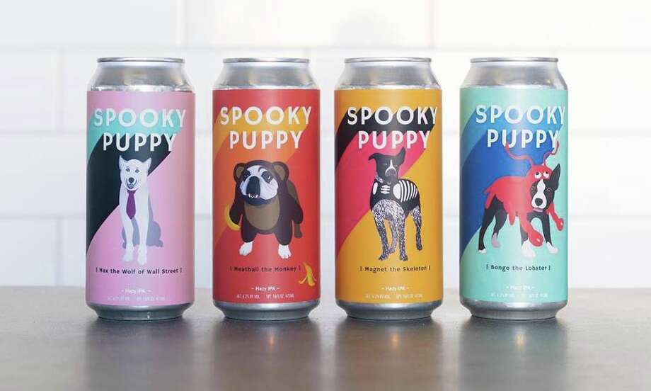
I'm going to finish this off with what might be my favorite place on the planet. Temescal Brewing is in my town, and I'm there once a week. They embody everything I've listed above. The taproom feels like it was pulled straight from Saved By The Bell. Fresh beer, no jerks. Pastel colors are used in every can, with fun, poppy designs that are sometimes subdued, sometimes loud. My favorites by them, by far, is the Spooky Puppy. Every year on Halloween, they have a doggy costume contest. They then pick 4 winners to be shown on the cans the next year. Beef, my French Bulldog, will be entering the contest. Everything they do is beautiful. I'm on my way to pick up their New Year's Brut IPA later this afternoon. I love you guys.


Comments
Post a Comment